Introduction to R: Lecture 5

Topics: Data Analysis and Graphs

Sabrina Nardin, Summer 2025

Agenda

  1. The scorecard Dataset
  2. Match Graph Types to Variable Types
  3. Practice

These slides were last updated on July 24, 2025

Our Goals Today

Practice using graphs for data analysis. Specifically:

  • Display variation and co-variation: Learn how to visualize the distribution of a single variable (e.g., cost to attend a school) and of two or more variables (e.g., cost and admrate).

  • Match graph type to variable type: Choose appropriate graph types depending on whether variables are categorical (e.g., school type), continuous (e.g., cost), or both.

  • Interpret the graph: Practice describing what a graph reveals — such as trends, group differences, and outliers.

1. The scorecard Dataset

About the scorecard dataset

The U.S. Department of Education collects annual statistics on colleges and universities in the United States: https://collegescorecard.ed.gov/data

This dataset includes variables such as:

  • name: name of the school
  • state: state where the school is located
  • type: school type (e.g., Public, Private Nonprofit, Private For-Profit)
  • admrate: admission rate (e.g., 0.91 = 91%)
  • cost: published cost of attendance
  • netcost: net cost of attendance after financial aid
  • satavg: average SAT score of admitted students
  • ...: many additional variables

We’ll focus on a subset of this data from the 2018–2019 academic year.

About the scorecard dataset

library(tidyverse)
library(rcis)
data(scorecard)
glimpse(scorecard)
Rows: 1,732
Columns: 14
$ unitid    <dbl> 100654, 100663, 100706, 100724, 100751, 100830, 100858, 1009…
$ name      <chr> "Alabama A & M University", "University of Alabama at Birmin…
$ state     <chr> "AL", "AL", "AL", "AL", "AL", "AL", "AL", "AL", "AL", "AL", …
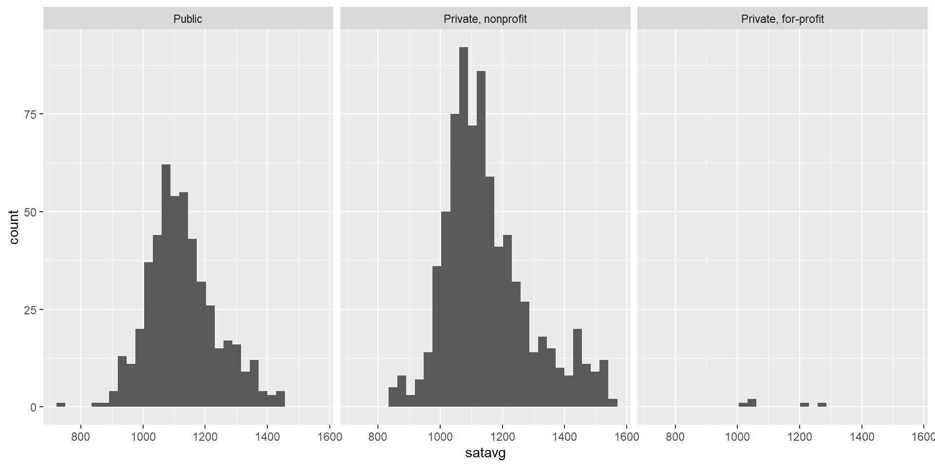
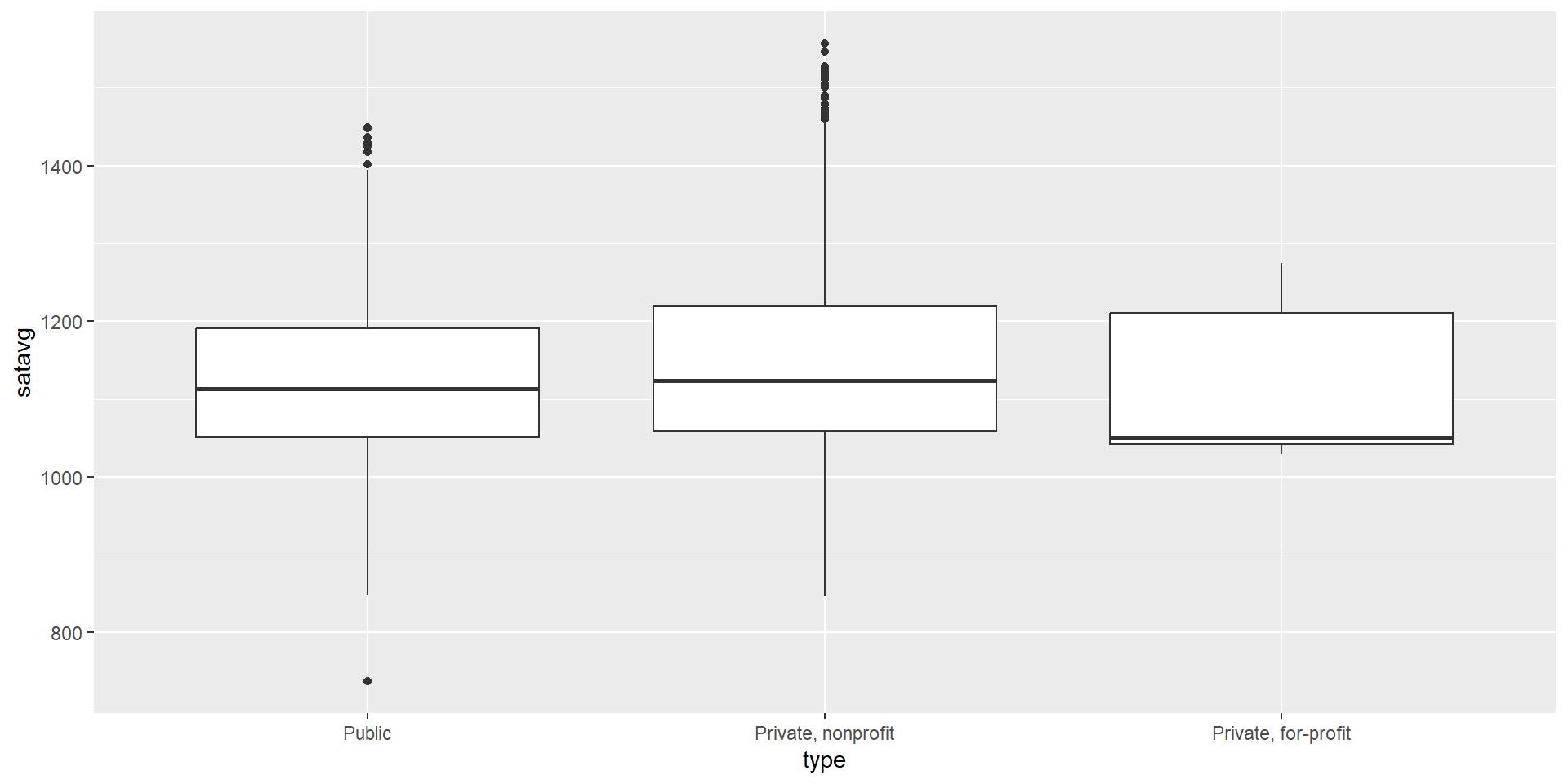
$ type      <fct> "Public", "Public", "Public", "Public", "Public", "Public", …
$ admrate   <dbl> 0.9175, 0.7366, 0.8257, 0.9690, 0.8268, 0.9044, 0.8067, 0.53…
$ satavg    <dbl> 939, 1234, 1319, 946, 1261, 1082, 1300, 1230, 1066, NA, 1076…
$ cost      <dbl> 23053, 24495, 23917, 21866, 29872, 19849, 31590, 32095, 3431…
$ netcost   <dbl> 14990, 16953, 15860, 13650, 22597, 13987, 24104, 22107, 2071…
$ avgfacsal <dbl> 69381, 99441, 87192, 64989, 92619, 71343, 96642, 56646, 5400…
$ pctpell   <dbl> 0.7019, 0.3512, 0.2536, 0.7627, 0.1772, 0.4644, 0.1455, 0.23…
$ comprate  <dbl> 0.2974, 0.6340, 0.5768, 0.3276, 0.7110, 0.3401, 0.7911, 0.69…
$ firstgen  <dbl> 0.3658281, 0.3412237, 0.3101322, 0.3434343, 0.2257127, 0.381…
$ debt      <dbl> 15250, 15085, 14000, 17500, 17671, 12000, 17500, 16000, 1425…
$ locale    <fct> City, City, City, City, City, City, City, City, City, Suburb…

The scorecard dataset: making a plot

Which type of college has the highest average SAT score?

# with faceted histogram
ggplot(data = scorecard, mapping = aes(x = satavg)) +
  geom_histogram() + 
  facet_wrap(facets = vars(type))

What’s a histogram?

Which type of college has the highest average SAT score?

# with a boxplot
ggplot(data = scorecard, mapping = aes(x = type, y = satavg)) +
  geom_boxplot()

What’s a boxplot?

The scorecard dataset: interpreting a plot

What do these graphs reveal about average SAT scores by type of college?

Interpreting plots is as important as writing code

According to these graphs, private nonprofit schools have the highest average SAT scores, closely followed by public schools, and then private for-profit schools.

But this interpretation doesn’t tell the full story:

  • From the histogram, we can see that each school type includes a different number of colleges. i.e., they have different sample sizes (private for-profit schools have far fewer schools than others).

  • This matters because averages based on small groups may not represent the broader category well. Looking at the full distribution gives us a more complete understanding.

The scorecard dataset: asking more questions, answering them with dplyr

How many schools are in each type?

scorecard %>% count(type) 

Which schools are categorized as private for-profit?

scorecard %>%
  filter(type == "Private, for-profit") %>%
  select(name, state, type, satavg, cost)

What about the University of Chicago?

scorecard %>% filter(name == "University of Chicago")

Etc.

Once you draw a plot, ask yourself:

Substantive questions:

  • What does this graph tell?
  • Are there patterns? Outliers?
  • What hypotheses can I generate?
  • What else I want to know?
  • Should I dig deeper with dplyr?
  • Etc.

Stylistic questions:

  • Is the chosen plot appropriate (match variable type)?
  • Is the plot clear and easy to understand?
  • Is it too busy or too simple?
  • Could it be improved? (titles, labels, colors, etc.)
  • Does I need to manipulate the data first?
  • Etc.

2. Matching Graph Types to Variable Types

Types of Visualizations and Best Graph Types

Do I want to represent variation in:

  • A single variable?
  • Two variables?
  • Three variables?

What type(s) are my variables?

  • Continuous (e.g., satavg average SAT score, cost published cost)
  • Categorical (e.g., type school type, state U.S. state)
  • Other types (often treated as categorical): ordinal, nominal, binary

Tip

Think about which variables you want to display and their type before choosing a graph!

Univariate (One Variable)

To show how values vary within a single variable:

  • One continuous variable → Histogram
  • One categorical variable → Bar Chart


Function What Gets Counted When to Use
geom_histogram() How many values fall into each numeric bin When x is continuous
geom_bar() How many observations are in each category When x is categorical


Bivariate (Two Variables)

To show how two variables co-vary:

  • Two continuous variables → Scatterplot
  • One categorical + one continuousBox Plot
  • Two categorical variables → Grouped or Stacked Bar Chart

Multivariate (Three Variables)

To compare patterns across subgroups:

  • One categorical + two continuousFaceted Scatterplot
  • Two categorical + one continuousGrouped Box Plot

These are the most common combinations. There are more options as you explore deeper!

Main Graph Types and When to Use Them

Type of Graph ggplot2 Function Input Variables Goal
Histogram geom_histogram() One continuous (e.g., age, income) Show the distribution of values
Bar Chart geom_bar() One categorical (e.g., region, gender) Show frequencies or counts of categories
Stacked Bar Chart geom_bar() + fill Two categorical variables (e.g., region by gender) Compare parts of a whole across categories
Scatterplot geom_point() Two continuous variables (e.g., height vs. weight, price vs. rating) Show relationship or correlation
Box Plot geom_boxplot() One continuous + one categorical (e.g., income by gender) Compare distributions, spot outliers
Faceted Scatterplot facet_wrap() + geom_point() Two continuous + one categorical (e.g., by country or year) Compare patterns across groups

3. Practice

💻 Practice

On the next slide, you’ll see a set of tasks. In small groups, use the scorecard dataset to create the most appropriate graph for each one.

  • Before plotting: Consider the type of variable and the type of variation you need to represent. Use the slides as reference.

  • While plotting: Keep it simple, as you would for an initial Exploratory Data Analysis (e.g., no need to add labels, legends, color adjustments, scales, themes, facets, etc.)

  • After plotting: Stare at the graph… look for patterns, outliers, or any notable features, and substantively interpret the graph.

💻 Practice

Share your solutions here https://codeshare.io/vAzK44

TASK 1: Plot the annual total cost of school attendance across the U.S. Hint: try geom_histogram() with the variable cost

TASK 2: Plot the total number of schools in the U.S. by school type. Hint: try geom_bar() with the variable variable type

TASK 3: Plot the annual total cost and net cost of attendance to schools in the U.S. (variables cost and netcost)

TASK 4: Plot the annual total cost of attendance by school type (variables cost and type)

TASK 5: Plot the annual total cost of attendance and net cost of attendance by school type (variables cost, netcost, type)

💻 Download Today Materials

Download today’s class materials from our website for:

  • further insights into these tasks (and solutions!)
  • additional practice exercises

Takeaways and Tips

Follow this approach to move from quick exploration to polished, communicative plots:

When exploring your data:

  • Start with simple and plots to get a sense of the distribution and relationships
  • Focus on interpretation first, not style
  • Ask questions: What stands out? Are there outliers, trends, or surprises? What else do you want to know?

Once you settle on a plot:

  • Refine the code to improve readability and aesthetics
  • Add styling elements (labels, scales, legends, and themes. etc. as needed)
  • Use polished plots for assignments, reports, or presentations

Typically, researchers create many exploratory plots and only a few make it to the final report.

Recap: What We Learned Today

  • Pick graph types that match the types of variables in your data
  • Read and interpret visualizations
  • Pracice using ggplot and dplyr

To print these slides as pdf

Click on the icon bottom-right corner > Tools > PDF Export Mode > Print as a Pdf